RD Widgets
LAST UPDATED: MAR 10, 2025
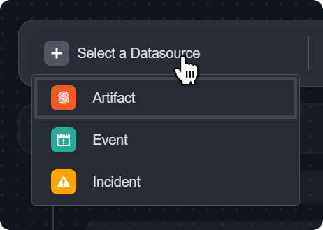
Widgets are visual representations of queries made from one of three system data sources, including Artifact, Event, and Incident. Once widgets are created, they can be added to and displayed in dashboards.
Creating a Widget
Step 1: Defining a Query
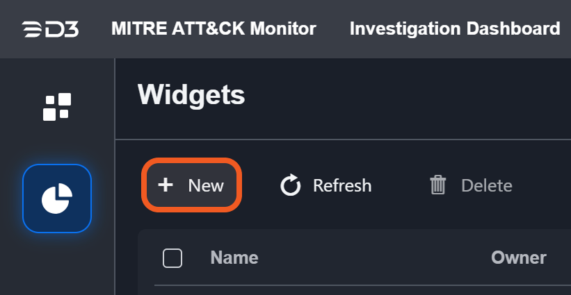
Open the Widgets tab from the left sidebar.
-20250310-173750.png?inst-v=f0ae511a-7398-4e63-b935-74c903306443)
Click on the +New button on the widgets page to begin creating a new widget.
The query builder will appear.
%202.jpg?inst-v=f0ae511a-7398-4e63-b935-74c903306443)
Choose a data source for the widget from the available options (Artifact, Event, or Incident).
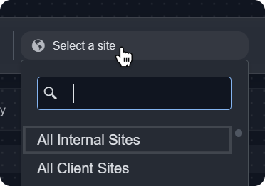
Select the site from which to retrieve the data.
Set the desired time range for the query.
(Optional) Configure expression blocks, fields and groups to construct your query.
Expression Blocks
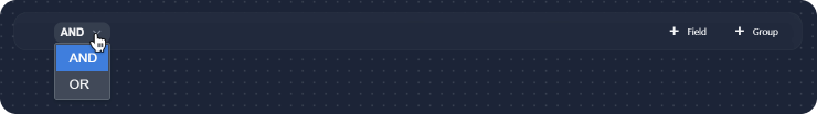
The option to add expression blocks will appear. You can use these to define filters for your widget. Each expression block consists of fields and/or groups with logic defined as AND or OR, indicated by the dropdown on the left of the expression block.
Fields
To add a field, click on the +Field button on the right of the expression block. You can add multiple fields to each expression block. Use the dropdown menu to select from a list of fields relevant to the previously selected data source. Then select an operator for each field. Please note that the available operators will differ depending on the selected field type.

Groups
Groups are nested expression blocks. They work the same way as a level one expression block. To create a group, set up the logic of the group (i.e., AND or OR), and add fields the same way. You can also add more groups within a group. To duplicate a group, click the Clone button.
Step 2: Running and Editing the Query
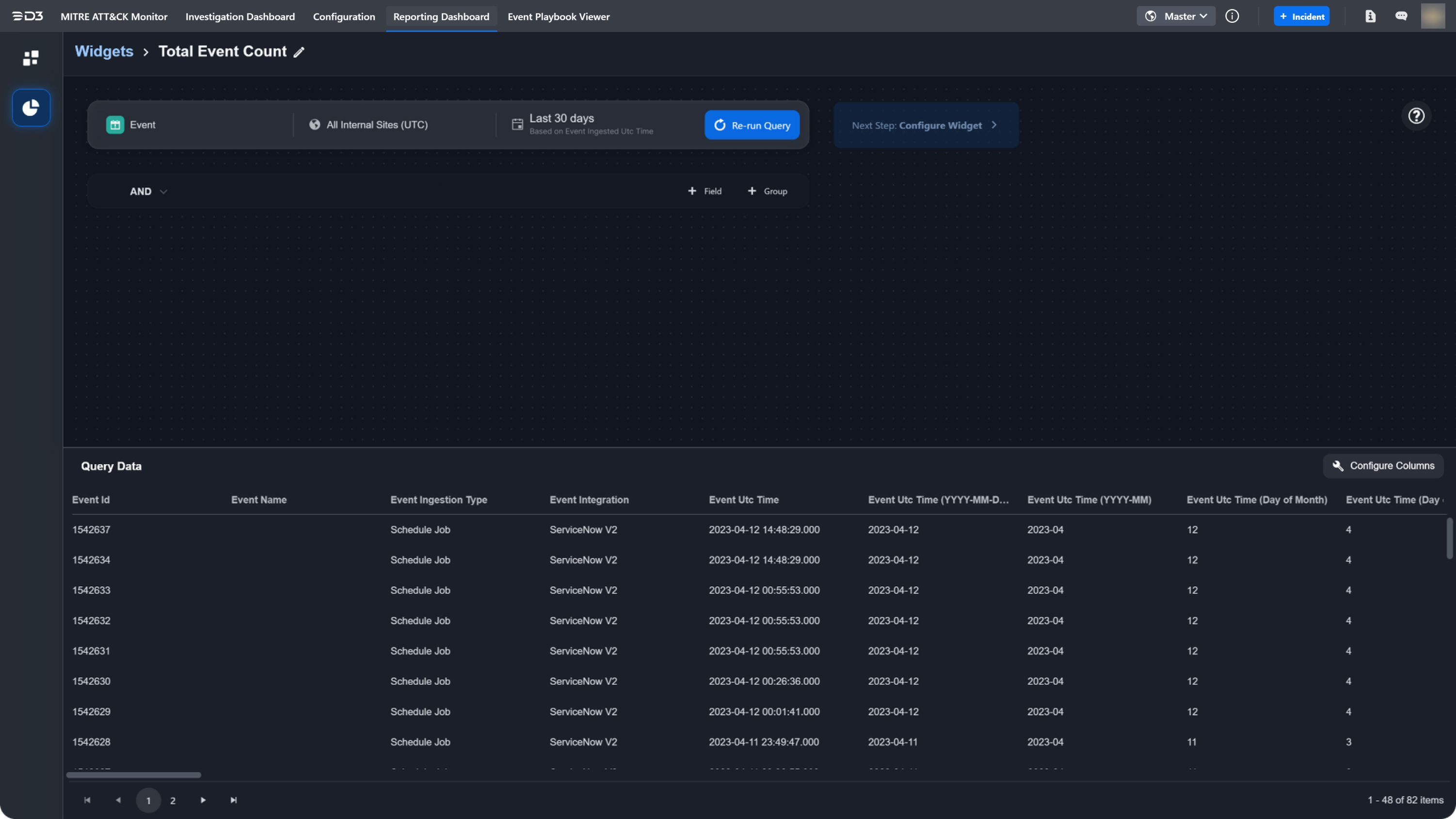
After defining your query, click Run Query to view the query data. The data will populate in the lower pane of the query builder. You have the option to edit, add or remove the columns returned by the query. To do this, click Configure Columns. You can add or remove columns to display different sets of data. To change the ordering, drag and drop the handles of a field. The ID field is not editable. After making changes, click Save to view your changes to the query data.
READER NOTE
You must run the query before you can proceed to the next step of configuring the widget. If the query configurations are modified, you must re-run the query before proceeding to the next step.
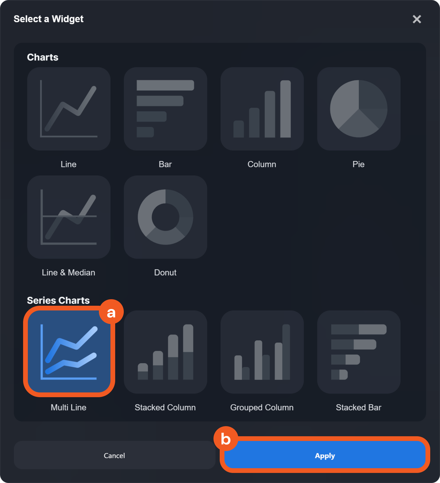
Step 3: Configuring the Widget
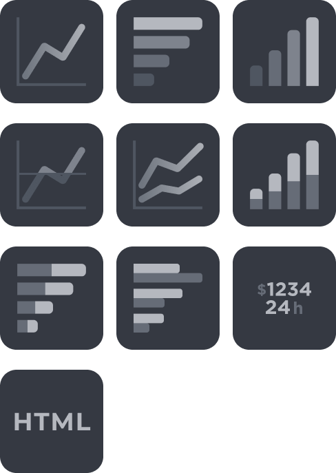
Next, configure the visualization type for the widget. Use the Widget type dropdown to select the visualization for your query. The available widget types are summarized below.
Widget Types
| Widget Type | Description |
|---|---|---|
Charts | Line  | Displays information as a series of data points connected by straight lines. Used to show trends over time or to compare different sets of data. |
Bar  | Uses rectangular bars to represent data. Used to compare different categories of data, such as sales figures or population sizes. | |
Column  | Uses vertical bars to represent data. Similar to a bar chart, but with bars oriented vertically. | |
Pie  | Uses slices of a circle to represent data. Often used to show how a whole is divided into parts or to compare different parts of a single dataset. | |
Line & Median  | Combines a line chart with a horizontal line that represents the median value of the data. Used to show how a dataset is distributed around its median. | |
Donut  | Similar to a pie chart, but with a hole in the center. Often used to show how a whole is divided into parts, but can also be used to compare different parts of a single dataset. | |
Series Charts | Multi Line  | Displays multiple lines to represent different datasets. Used to compare trends over time or to compare different sets of data. |
Stacked Column  | Uses vertical bars to represent data, with each bar broken down into smaller sections that represent different categories of data. Used to show how a whole is divided into parts and how those parts relate to each other. | |
Grouped Column  | Uses vertical bars to represent data, with each bar representing a different category of data. Often used to compare different categories of data side by side. | |
Stacked Bar  | Uses horizontal bars to represent data, with each bar broken down into smaller sections that represent different categories of data. Used to show how a whole is divided into parts and how those parts relate to each other. | |
Grouped Bar  | Uses horizontal bars to represent data, with each bar representing a different category of data. Often used to compare different categories of data side by side. | |
Table | Table  | Displays data in a tabular format with rows and columns. |
Others | Numbers  | Displays a single fact, or a single data point. This is used when a single number is the most important thing you want to track in your dashboard or report, such as total incident count, auto-escalated rate, or total saved hours. |
HTML  | Uses HTML to display information as text or tables. | |
List  | Displays a list of data points, often used for ranking data. |
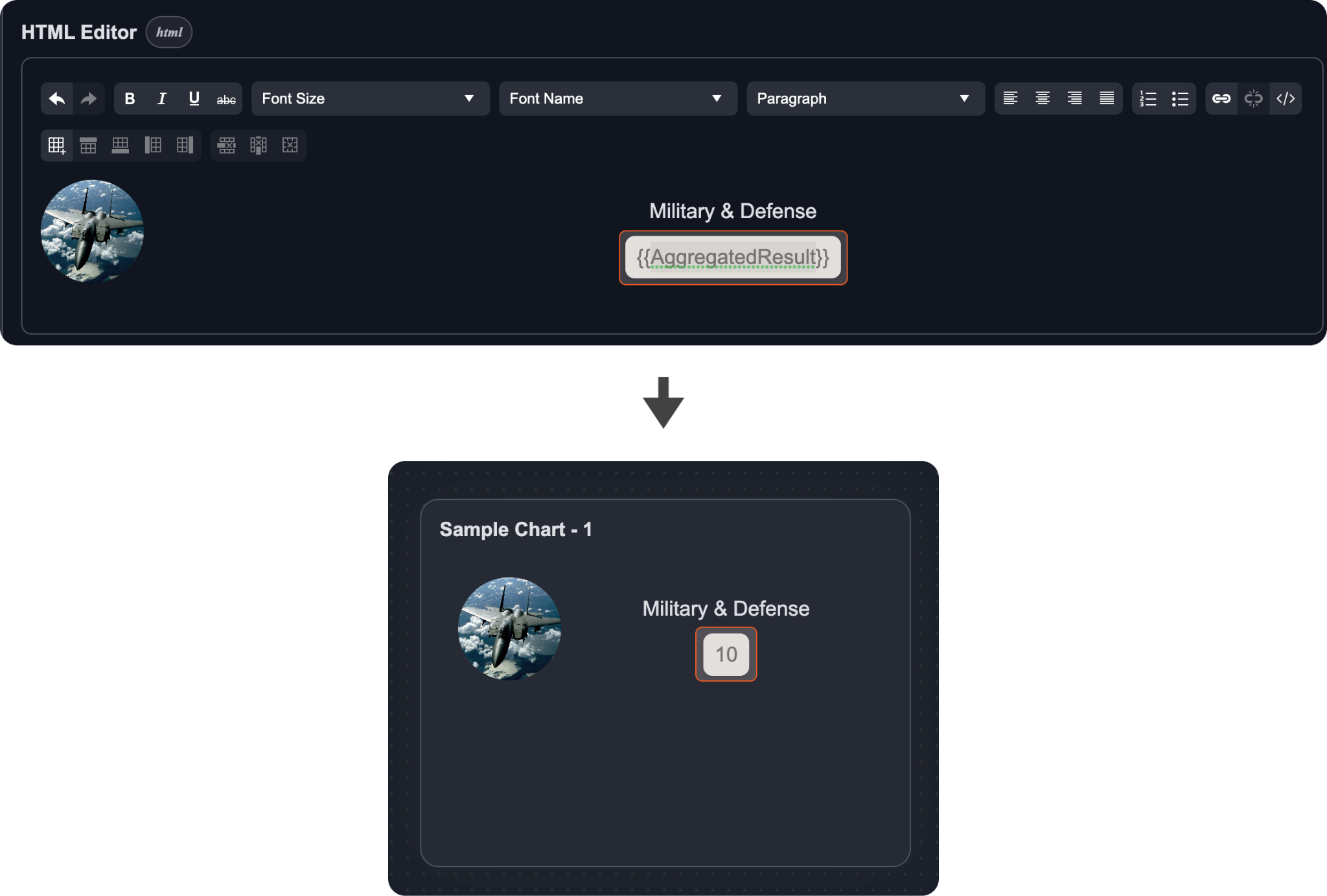
Each type of widget offers various configuration options. Refer to the descriptions provided for each configurable field in the table below to assist you in building your widget type. In most cases, you can select values from a dropdown menu for the widget fields. However, the HTML editor field is an exception, as it provides a rich text field box for inputting HTML values.
%201.jpg?inst-v=f0ae511a-7398-4e63-b935-74c903306443)
For example, if you want to create a multi-line chart widget to display the daily event count by event status, you would set the Group By field to "Event Utc Time (YYYY-MM-DD)", the Secondary Group By field to "Event Status", and the Aggregation field to "COUNT".
Widget Fields
Widget Fields | Description | Applicable Widget Types |
|---|---|---|
Group By | The category of data that will be plotted on the main axis. For example, a chart that displays incidents over time, a count of incidents will be grouped by their date of occurrence. |  |
Secondary Group By | A second comparative category to be plotted along the main axis. For example, in a chart that compares high and low severity incidents over time, the secondary group by is severity. |  |
Aggregation | The summary of data points from the raw data. For example, performing a count aggregation on incidents can return the number of total incidents. The available types of aggregation are: count, average, summation, maximum, minimum, median and mode.
|  |
Colour Field | The category to be displayed as sections. For example, in a chart that shows the occurrence of incident types, the colour field will be the incident type.
|  |
Angular Field | The category to be aggregated. For example, in a chart that shows the occurrence of incident types, the angular field is the proportion of each incident type. | 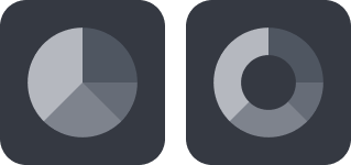 |
HTML Editor | Edit the HTML rich text content to display. You can incorporate the dynamic value of the aggregation field with
 |  |
Primary Field | The field to be displayed first in a list item. |  |
Secondary Field | The field to be displayed second in a list item. |  |
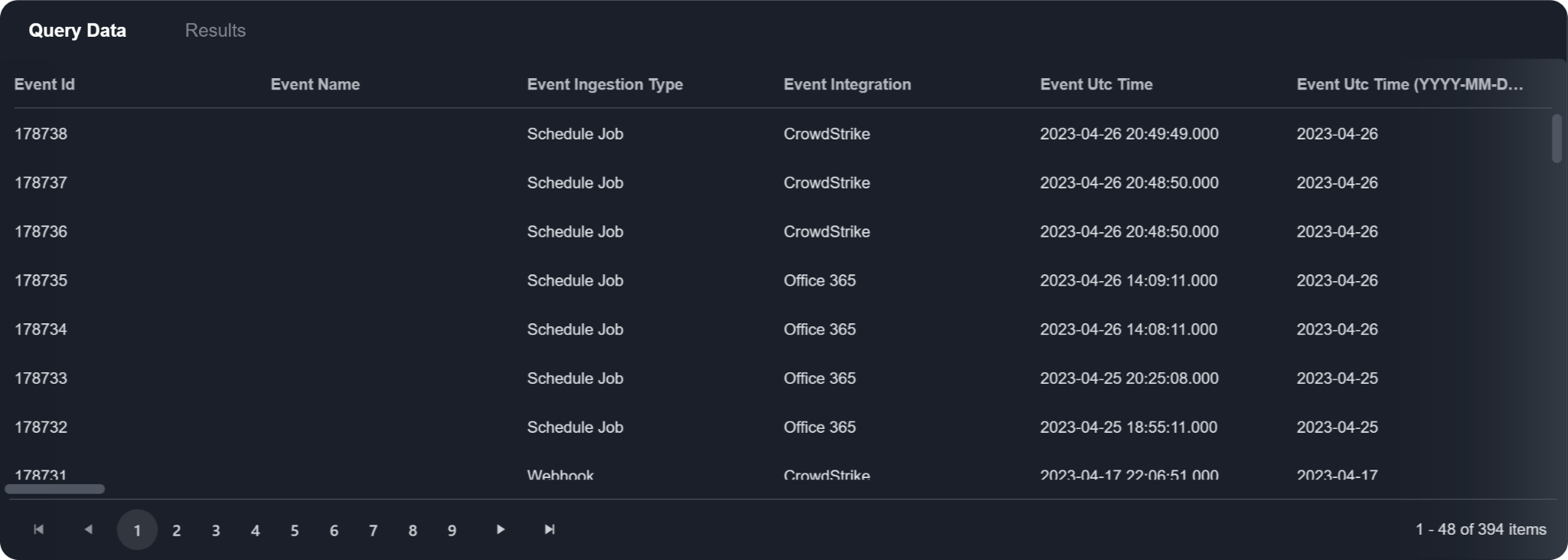
Once you have configured the widget fields, you will find the queried data and the aggregated data displayed in the bottom pane. The Query Data tab shows the queried data, which is returned from the query set defined in the previous query stage. The Results tab displays the aggregated data, which is derived from the configured widget fields.
A live preview of the widget is shown on the right pane, with further configurable widget options available to fine-tune the widget. Refer to the full list of configurable widget options below for more information.
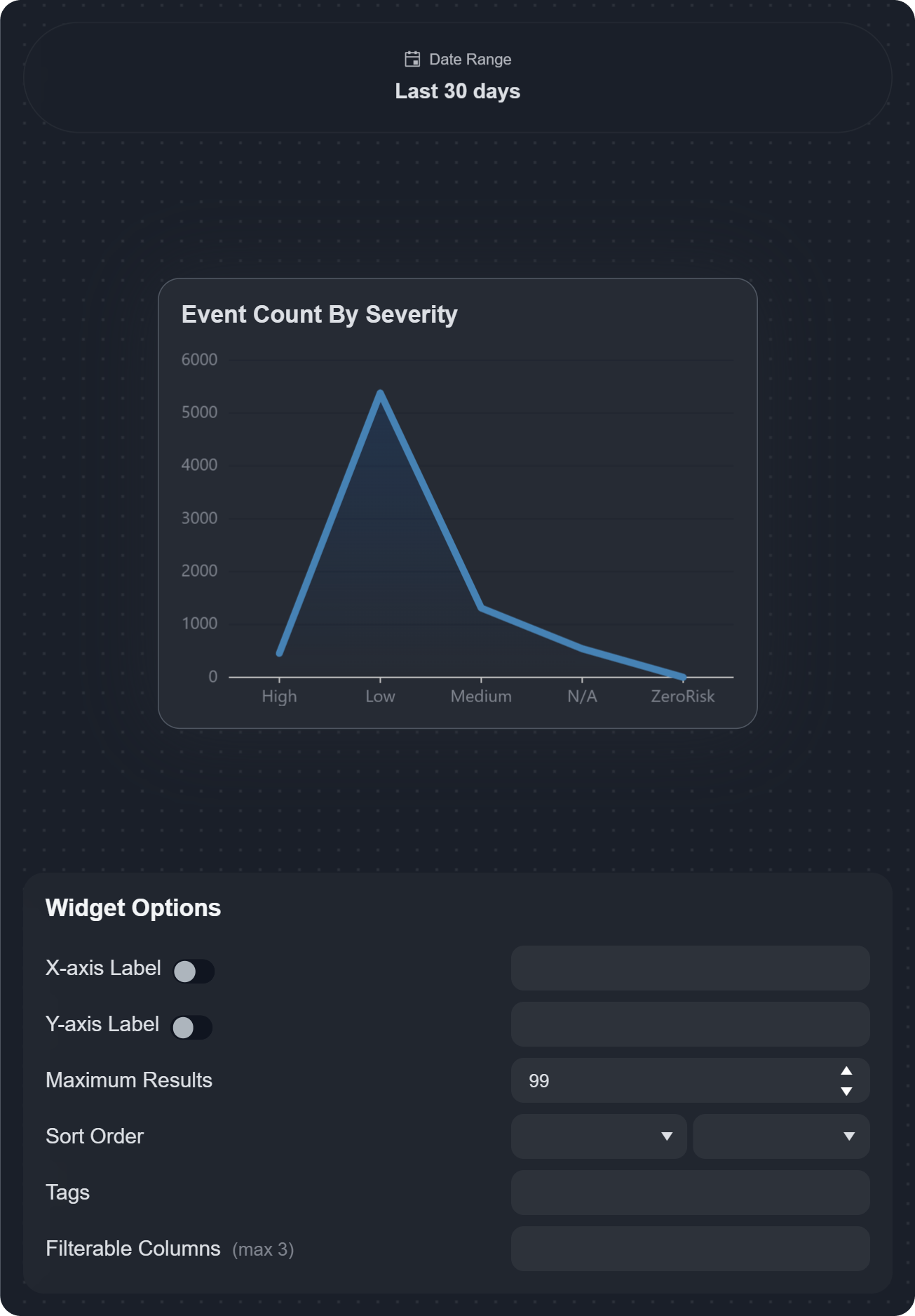
Widget Options
Widget Options | Description | Applicable Widget Types |
|---|---|---|
X-axis label | Enables and defines a label for the x-axis on the chart. | 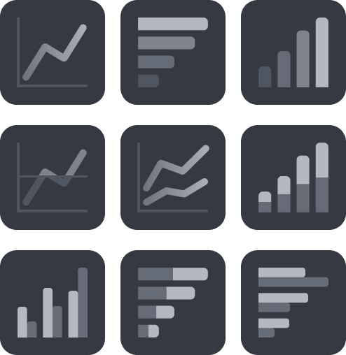 |
Y-axis label | Enables and defines a label for the y-axis on the chart. |  |
Maximum Results | Sets the maximum number of aggregated results to display as data points on the chart. |
 |
Sort Order | Sets the sorting order (ascending or descending) of data points displayed on the chart. You can sort by widget-specific fields or choose no sorting. | 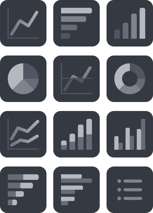
|
Tags | Allows you to add custom tags for organizing widgets. | 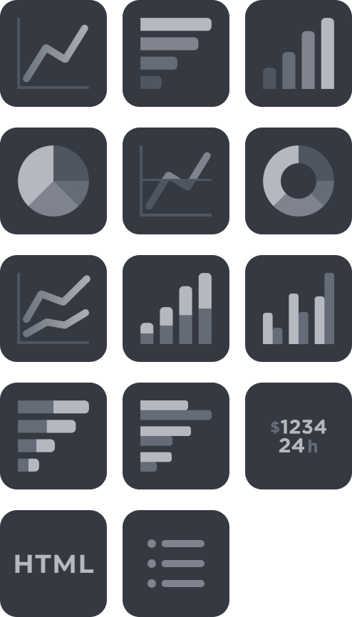 |
Filterable Columns | Add up to 3 extra data points to further filter data within a widget. These filters are accessible directly on widgets in the dashboard to help you narrow down the data to display in a chart on the fly. READER NOTE | 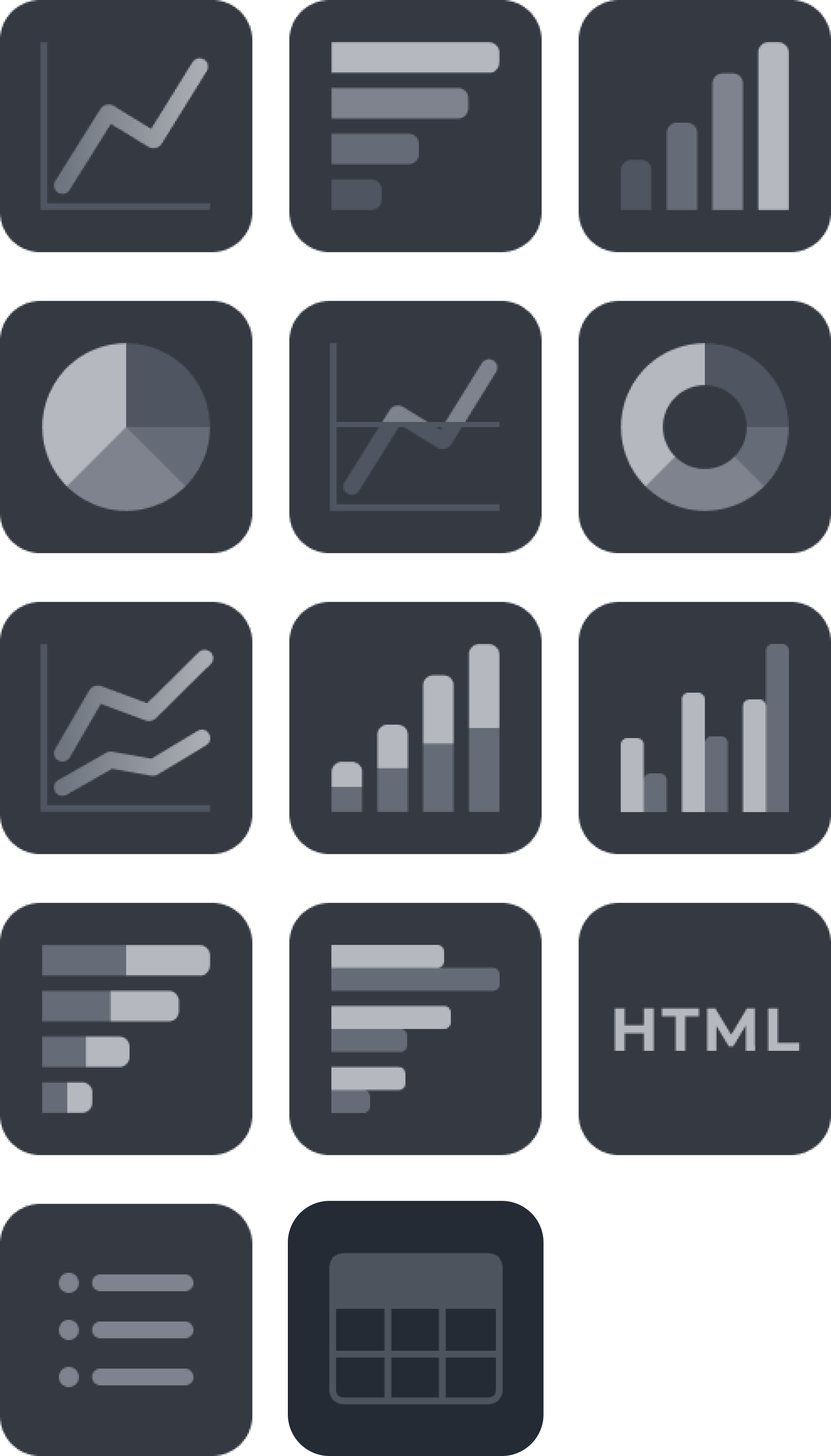
|
Unit | Specifies the unit of measurement for numerical data displayed on the chart. The unit can be placed before (e.g. $15,000) or after (e.g. 15,000 USD) the numerical value. | 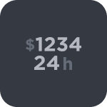 |
Permissions
After configuring your widget type, set the viewing permissions for the widget. Click Permissions in the upper right corner.
There are two main ways to configure permissions:
By Site:
Default Role Configuration: Each added site allows you to specify a default permission role, which can be set to either "Viewer", "Editor", or "Not Set". When a new site is added to the list, its default role is automatically set to "Viewer".
Role or Group within a Site: Roles or groups that are defined under a site can override the site's default permission role. The more specific configuration will always take precedence over a general one. For example, if Site A's default is set to "Viewer", but Group A within Site A is designated as "Editor", then users within Group A will have editor permissions.
By User:
Each added user allows you to specify a permission role, which can be set to either "Viewer", "Editor", or "Not Set". When a new user is added to the list, its default role is automatically set to "Viewer".
Understanding the Permission Roles
Editors: Can edit and modify widgets, and set up email schedules for sharing.
Viewers: Limited to viewing the widget.
Private Mode
When Private Mode is activated, only the original creator of the widget will have the permissions to view and edit it.
Widget Examples
OBJECTIVE
Setting up a widget to track incident creation trends by severity over time, using data from the last 7 days.
Configure the widget to display incidents from a selected site or all sites within the past specified number of days, then click on the Run Query button.
.png?inst-v=f0ae511a-7398-4e63-b935-74c903306443)
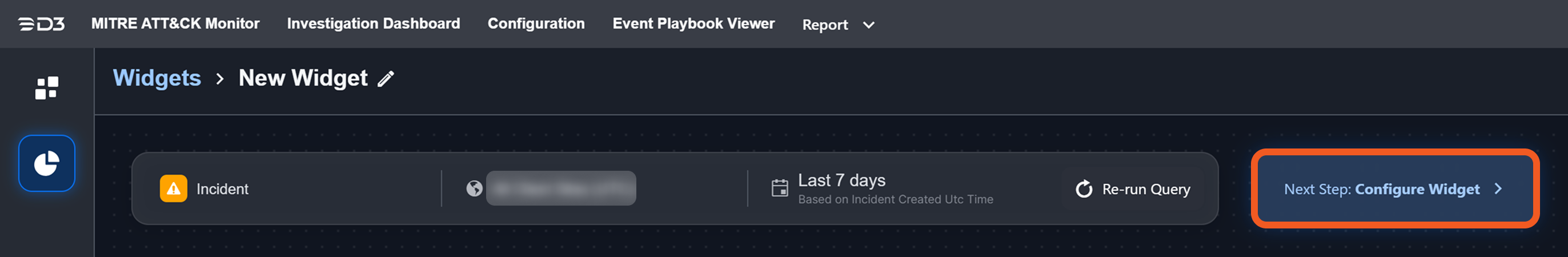
Click on the Next Step button.
.png?inst-v=f0ae511a-7398-4e63-b935-74c903306443)
Select the Multi Line chart type, then click on the Apply button.
Set the Group By field to Incident Created Utc Time (YYYY-MM-DD), then set the Secondary Group By field to Incident Severity.
.png?inst-v=f0ae511a-7398-4e63-b935-74c903306443)
Define labels for the X- and Y-axis and set the maximum number of data points to include.
-20250308-000625.png?inst-v=f0ae511a-7398-4e63-b935-74c903306443)
Click on legend items to toggle the visibility of severity categories (Critical, High, Medium, Low, Informational) on the graph.
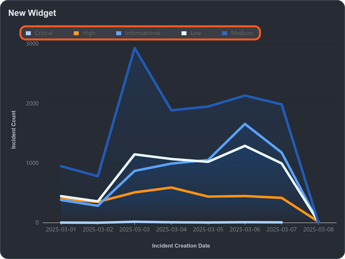
If Informational, Low, and Critical severities are toggled off, the graph will appear as follows:
%201%20(1).png?inst-v=f0ae511a-7398-4e63-b935-74c903306443)
OBJECTIVE
Setting up a widget to track Microsoft Sentinel incident volume by hour of the day, using data from the last 7 days.
Configure the widget to display Microsoft Sentinel incidents from a selected site or all sites within the past specified number of days, then click on the Run Query button.
-20250308-013546.png?inst-v=f0ae511a-7398-4e63-b935-74c903306443)
Click on the Next Step button.
Select the Multi Line chart type, then click on the Apply button.
Set the Group By field to Incident Created Utc Time (Hour of Day), then set the Secondary Group By field to Incident Created Utc Time (Day of Week).
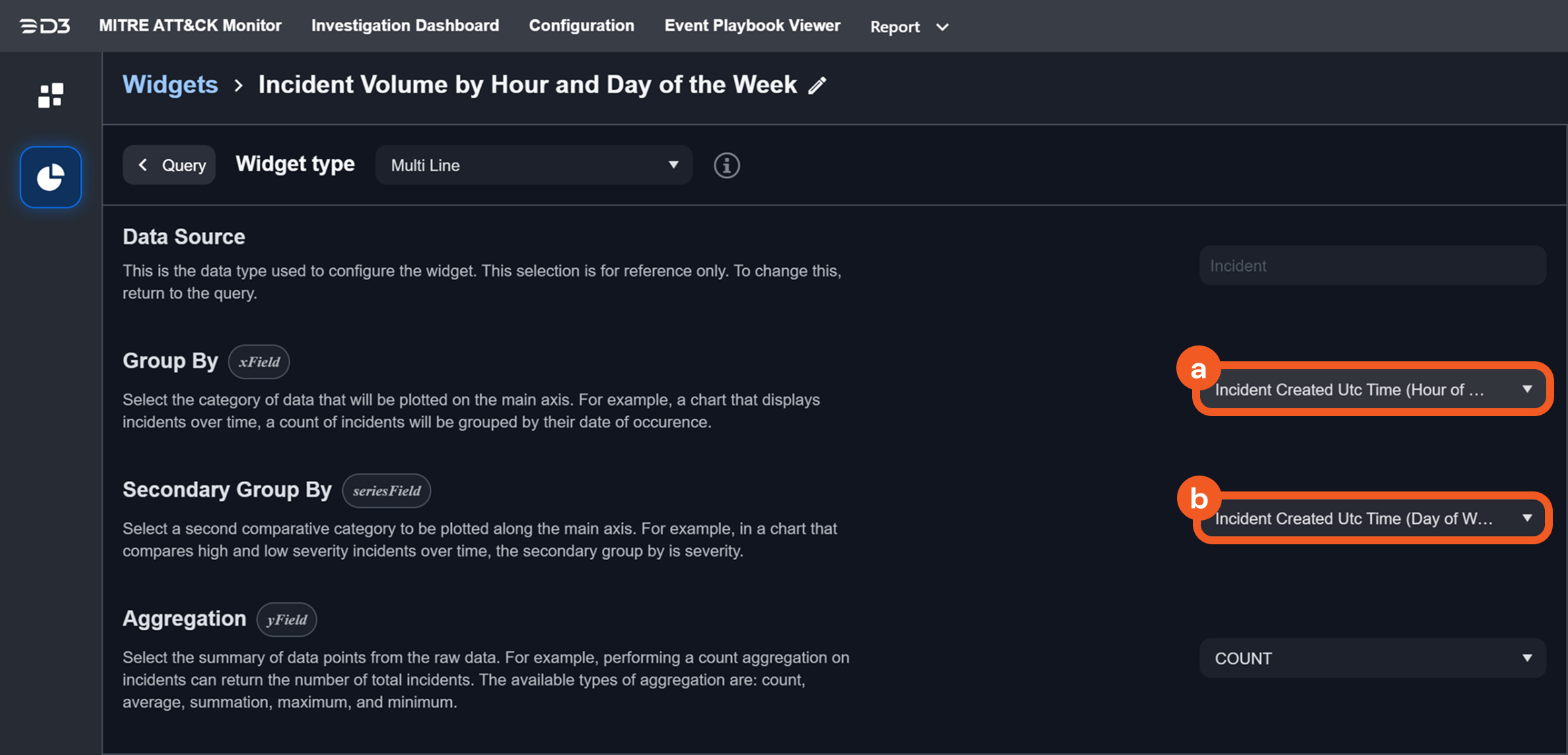
Define labels for the X- and Y-axis and set the maximum number of data points to include.
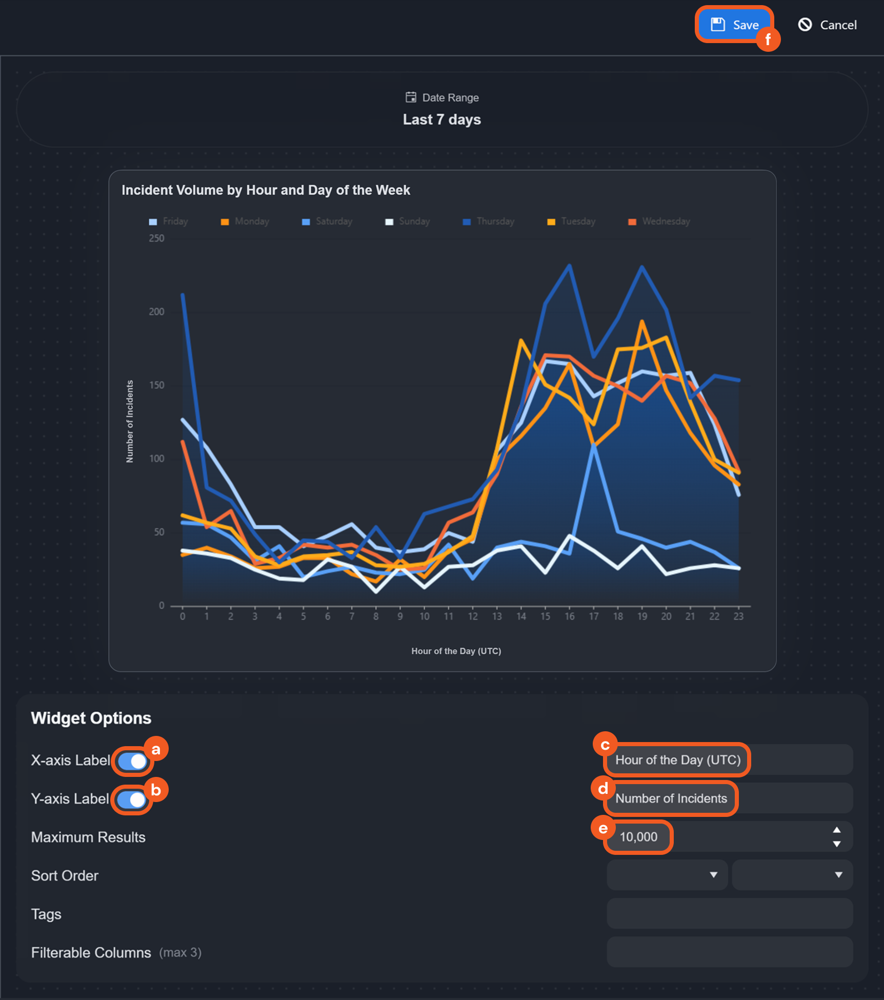
Click on legend items to toggle the visibility of day categories (Monday-Sunday) on the graph.
-20250308-021044.png?inst-v=f0ae511a-7398-4e63-b935-74c903306443)
If only Friday and Saturday are toggled on, the graph will appear as follows:
%201%20(1)-20250308-021121.png?inst-v=f0ae511a-7398-4e63-b935-74c903306443)
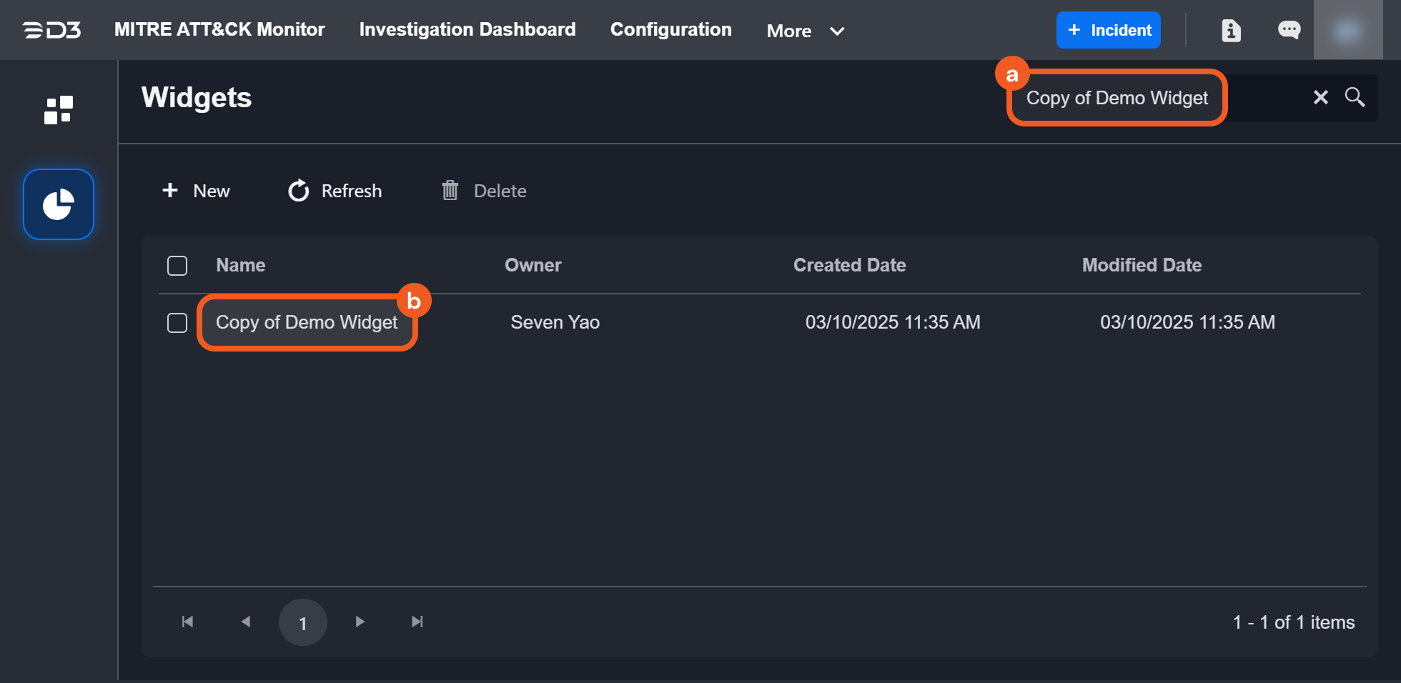
Cloning a Widget
To clone an existing widget, users must select it from the list of dashboards. If the selected dashboard was not created by the user but is viewable based on permissions, the Clone button will appear near the upper right corner.
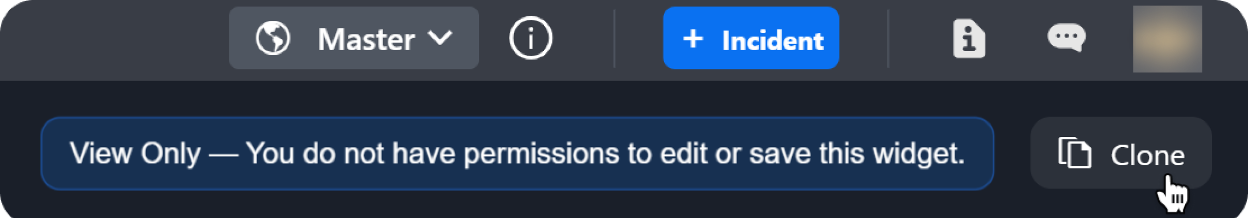
For widgets created by the user, the Clone option is located within the ellipsis menu in the upper right corner.
-20250310-183437.png?inst-v=f0ae511a-7398-4e63-b935-74c903306443)
The cloned widget will appear in the overview page of the Widgets tab.